什么是热点图?
- 热点图,就是看到这个图像,能够让人豁然开朗,明白要表达什么。
上源码
css部分
1
2
3
4
5
6
7
8
9
10
11
12
13
14
15
16
17
18
19
20
21
22
23
24
25
26
27
28
29
30
31
32
33
34
35
36
37
38
39
40
41
42
43
44
45
46
47
48
49
50
51
52
53
54
55
56
57
58
59
60
61
62
63
64
65
66
67
68
69
70
71
72
73
74
75
76
77
78
<style>
body {
background-color: #333;
}
.map {
position: relative;
width: 747px;
height: 617px;
background: url(media/map.png) no-repeat;
margin: 0 auto;
}
.city {
position: absolute;
top: 225px;
right: 191px;
color: #fff;
}
.tb {
top: 500px;
right: 80px;
}
.gd {
top: 535px;
right: 186px
}
.dotted {
width: 8px;
height: 8px;
background-color: #09f;
border-radius: 50%;
}
.city div[class^="pulse"] {
/* 保证纸盒子在父盒子中垂直居中,然后向外发散 */
position: absolute;
top: 50%;
left: 50%;
transform: translate(-50%, -50%);
width: 8px;
height: 8px;
/* 这里不给背景,用盒子影阴最好看 */
/* background-color: #09f; */
/* 盒子阴影 */
box-shadow: 0 0 12px #009dfd;
border-radius: 50%;
animation: pulse 1.2s linear infinite;
}
.city div.pulse2 {
animation-delay: 0.4s;
}
.city div.pulse3 {
animation-delay: 0.8s;
}
/* 给子盒子做动画 */
@keyframes pulse {
0% {}
70% {
/* 这里不用transform:scale(n),因为它会让阴影变大 */
width: 40PX;
height: 40px;
/* opacity透明度 0--1 */
opacity: 1;
}
100% {
width: 70px;
height: 70px;
opacity: 0;
}
}
</style>html部分
1
2
3
4
5
6
7
8
9
10
11
12
13
14
15
16
17
18
19
20
21
22
23<body>
<!-- tb:台北 gd:广东 -->
<div class="map">
<div class="city">
<div class="dotted"></div>
<div class="pulse1"></div>
<div class="pulse2"></div>
<div class="pulse3"></div>
</div>
<div class="city tb">
<div class="dotted"></div>
<div class="pulse1"></div>
<div class="pulse2"></div>
<div class="pulse3"></div>
</div>
<div class="city gd">
<div class="dotted"></div>
<div class="pulse1"></div>
<div class="pulse2"></div>
<div class="pulse3"></div>
</div>
</div>
</body>输出结果
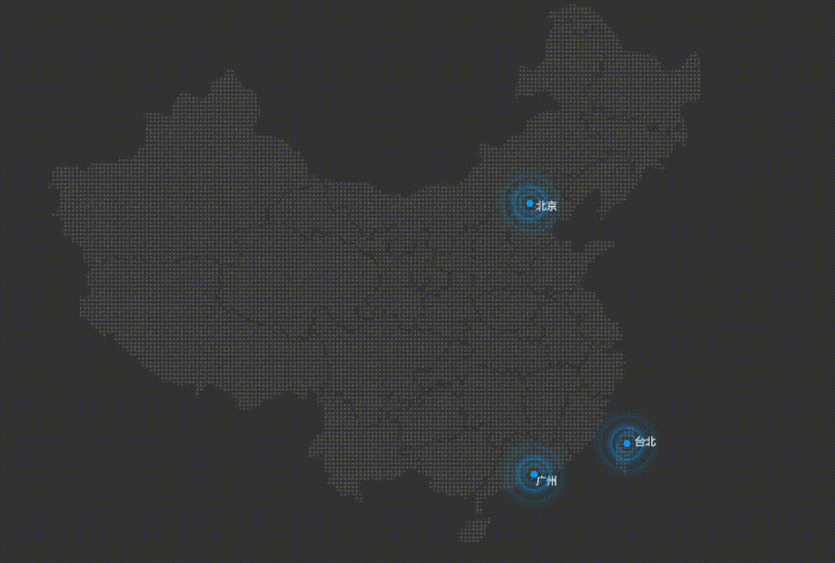
是不是很好玩呢?你学废了吗?


- 本文作者: it JinZhan
- 本文链接: http://example.com/2021/08/14/2021-8-14-原生代码实现热点图/
- 版权声明: 本博客所有文章除特别声明外,均采用 MIT 许可协议。转载请注明出处!